


 To begin with, let me tell you that I was aware that a home should have flow with colors & a tone that relates to one another throughout the rooms, but I totally disregarded this because I knew I would only be living there for a short time & I wanted to go crazy with colors, to experiment. And experiment I did...

I ended up replacing it with this one below. I also can't tell you how proud I was of the arrangement of mirrors. Virtually everything in the space was a hand-me-down so it never really felt like "me."
 We painted the kitchen in a terra cotta and (here's where it gets bad) the dining room in BLUE. hahaha oh well... talk about flow! The rooms were fairly closed off from one another but from one point in the entryway, if you looked just right you could see all 3 colors at once. I kid you not, I kind of loved it & would stand there to see all 3 colors at once, telling my roommate, "Oh look! If you stand here it's like a rainbow!!!" hahahahaha

 We also knocked over an entire gallon of paint on the white carpet and had to rip it out to expose the hardwood parquet underneath. Now, this was an apartment and when this happened, I did not expect to get my deposit back, but they did give it back!! WOW love them!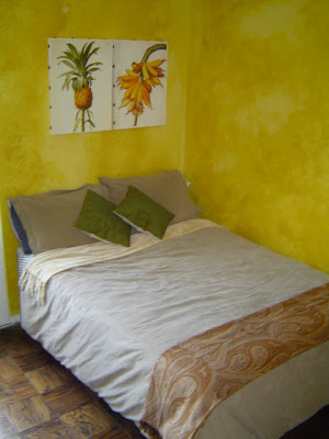

 When I painted the bedroom & bathroom a pale blue & got the Bombay bed, I would say it was at this point that I started getting a sense of what was "me." I repainted my bathroom a pale blue to match the pretty toile shower curtain I got from Restoration Hardware at a wedding shower. (below)

I wish I had photos for you of the dining room & kitchen. All the pics above were one of the first times I'd ever taken photos of interiors & I also have to say, I learned a lot about styling & angles & lighting from taking these shots. I learned you should try never to use flash (as I did in lots of these!! :) as it makes the room look dark & cheap. (But here's another trick-- I TOTALLY use flash in my "befores'!!! this is twofold: 1) the afters look way better in comparison, haha but 2) You get lots of detail when you're using them for referencing on projects)

Anyway, I think it's so interesting to see how we all start out at the beginning and have the ability to educate ourselves. It was through my experimenting & eventual education & reading-reading-reading that I began to grasp what good design was. I'm not going to kid myself though, I'm sure I'll one day look back on where I am right now & feel the same way I do about this apartment!! Our tastes are constantly evolving & we're constantly honing our skills.

I had to laugh when I read an article about Darryl Carter experimenting in his first DC condo and calling it his "laboratory." Well, his experimenting led to a spread in Met Home!! Like I said, we all start out somewhere!!
xoxo,
lauren


