Let’s start with the basics – Vignette 101
Pronunciation: \vin-ˈyet, vēn
Function: noun
Etymology: French, from Middle French vignete, from diminutive of vigne vine — more at vine
Date: 1611
Definition:
-A decorative design placed at the beginning or end of a book or chapter of a book or along the border of a page.
-Any brief composition or self‐contained passage.
-Merriam Webster Dictionary
I believe that any decorative project is not complete without those important details which communicate the owners' real and authentic personality. The careful positioning of the artwork, the display of meaningful collections or the placement of decorative objects all provide the visual and emotional declaration of the home owners living quarters.
The following design vignettes provide a selection of examples that have been successfully applied in the homes designed by the late master of design, David Hicks.
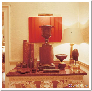
This vignette is carefully planned, it has a strong focal point and the pieces are placed in a trianglular shape. The strong colour in the painting frames the most important piece and focuses the attention on it. The rest of the pieces are all in the same colour tones but with different textures and sizes, creating visual interest while maintaining a focus on the urn.
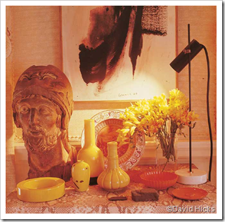
This is a great example of an asymmetrical vignette. The main focal point is the Greek warrior. The black lines of the painting and the angle of the lamp creates an invisible line that directs attention towards the Greek warrior. The rest of the elements are a combination of yellow, orange, and coral (an analogous colour scheme) ceramics that reflect light.
You can see some of the same elements being used in this vignette however it tells a different story. Firstly you can see that the side table and the credenza host different vignettes. The connection between the two vignettes is being made through the use of complementary colour schemes.
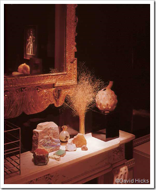
The next vignette is one of my personal favourites; the black high gloss walls reflect light, while the mirror reflects other aspects of the room. The rest of the elements in the vignette are absorbing light. This vignette also shows that you can make a vignette out of almost anything – in this case a unique collection of mineral crystals.
The next vignette complements the wallpaper and becomes part of the graphic architecture created by the soft visual textures. The marble pieces and the flowers add a sense of romanticism to the space.
This is definitely one of the most interesting vignettes I have ever seen. The Greek archeological pieces are carefully placed with museum quality inside of a transparent acrylic cube. The soft light in the background view frames the vignette.


No comments:
Post a Comment