


As designers, we work with colour all the time and one of our main tools of the trade is the colour fans. Each company has there own style and system but it is quite cool to see what was in use many years ago.
Last week, I received another great present – yes, from the same aunt who gave me the Cosmopolitan covers not too long ago, which inspired my entry Cosmopolitan Magazine Then and Now.


Centennial Edition

A classic exercise in colour - Which of the Greens on the page is darker?
Believe it or not they are the same!


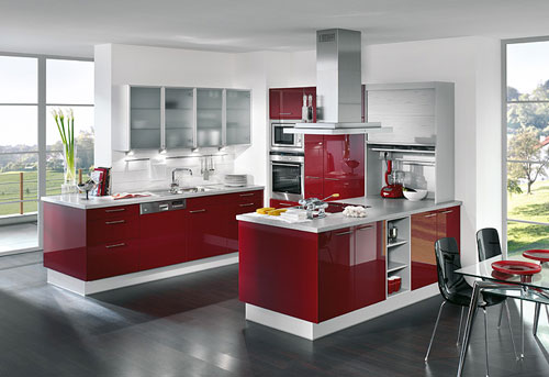
I had my fair share of this kind of room as before shots in my interior design projects in Victoria BC. I think this was a very popular colour combo back in the day. Avocado fridges anyone?


The colour catalogue has these cool cut-outs to see the colour trends of 1965. Colours like Alligator or Casablanca were the big hits. Not too far from what is going to be trendy in the near future.


Casablanca Accent 553
By the way the gift came slightly incomplete there is a little bit of damage including a missing back – Gotta love that aunt with all her wonderful “treasures”.


No comments:
Post a Comment